For quite a few millennials, the first glimpse of his boxy dogs, rubbery people, the crawling “radiant baby”, and saturated colours was of the animations done in his style on Sesame Street in the 90s. These were tributes, of course, as Keith Haring passed away of AIDS-related complications in February 1990. But the images he painted still mesmerize people.
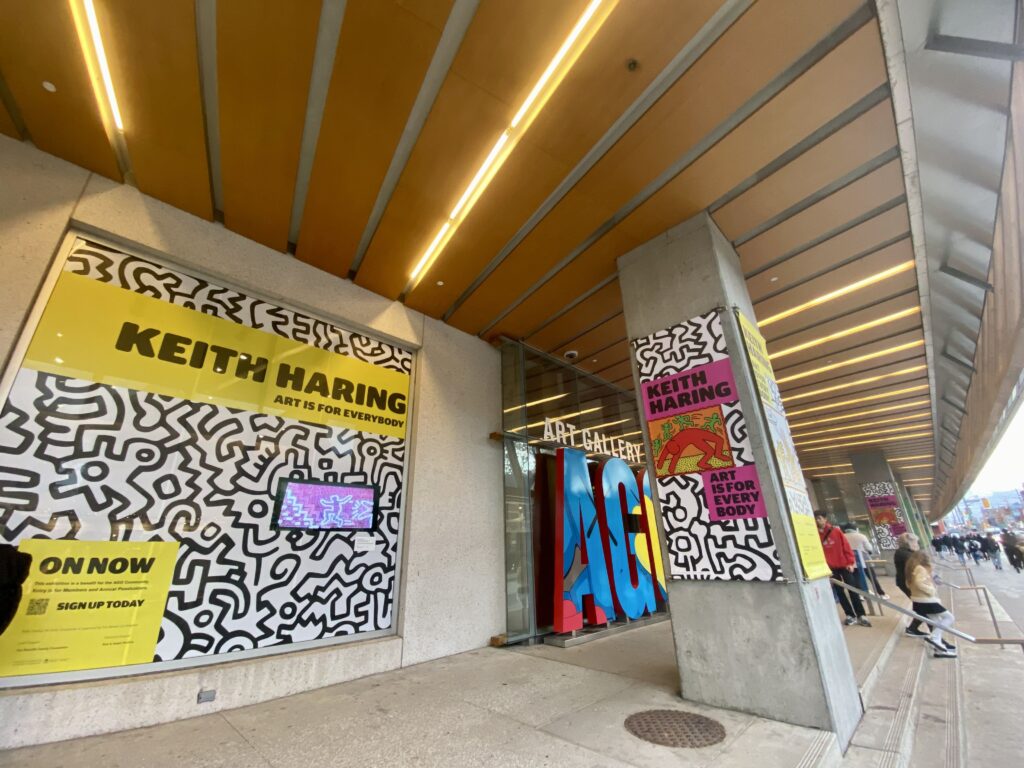
Crowds have streamed into the Art Gallery of Ontario at all hours to take it all in since the gallery opened the doors to its exhibition, Keith Haring: Art Is for Everybody on November 8th, 2023. True to the name of the exhibit, Haring made art that was direct and for everyone. You can’t ignore it. He had a brilliantly colourful style, electrically animated (either figuratively or literally) through his line work.

This is one talking point that you’ll run into quite a bit at the exhibit. Haring said himself, “The ‘social responsibility’ that I find in my work is found in the LINE itself.” Within each piece, he was consistent with his lines, enclosing his characters and subject matter with them, adding sound and movement through them. It’s almost like the closure of a line started the beating heart of the drawing.
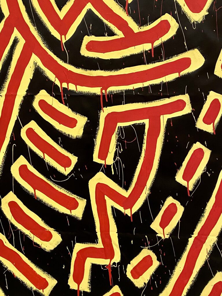
He was fast, with a technique that has an undeniable connection to the New York City graffiti that surrounded him from 1978 onward.
However, he wasn’t overly sentimental about each line. At times, looking closely at the pieces, you’ll see the paint that dripped downward with gravity. He was fast, with a technique that has an undeniable connection to the New York City graffiti that surrounded him from 1978 onward, when he moved from Pennsylvania to New York City to study at the School of Visual Arts. Graffiti, pop art, hip hop, punk, new wave—young and uninhibited artistic movements in the Big Apple all formed his intense, physical style.
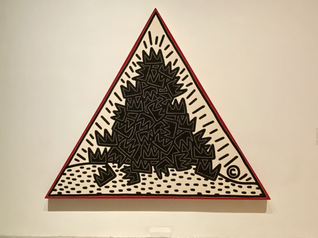
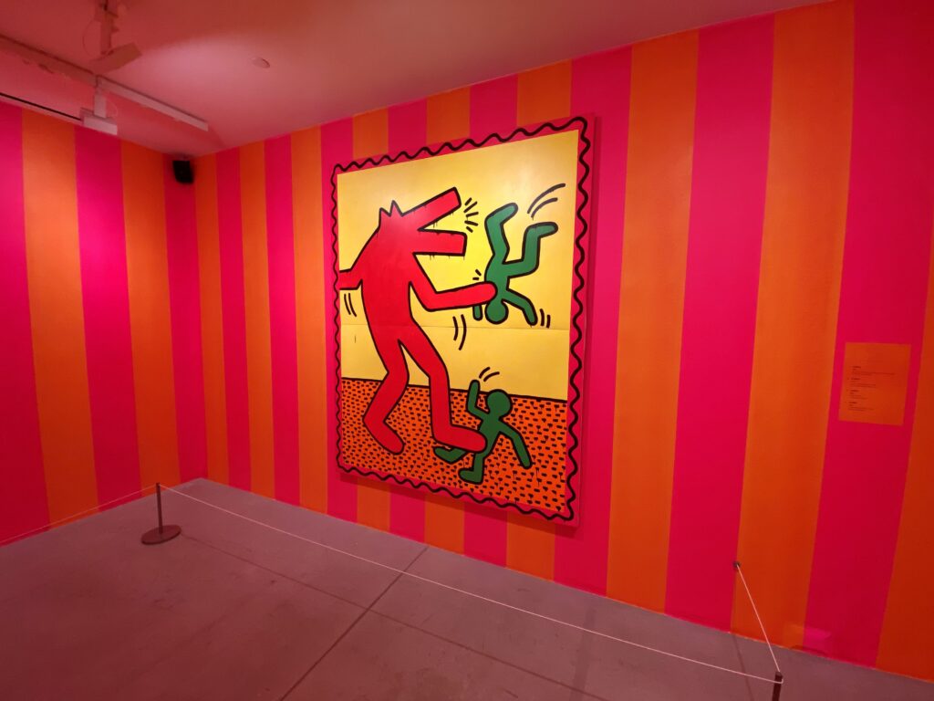
Far more important was the use of his large symbols, or “modern hieroglyphics” as they came to be known.
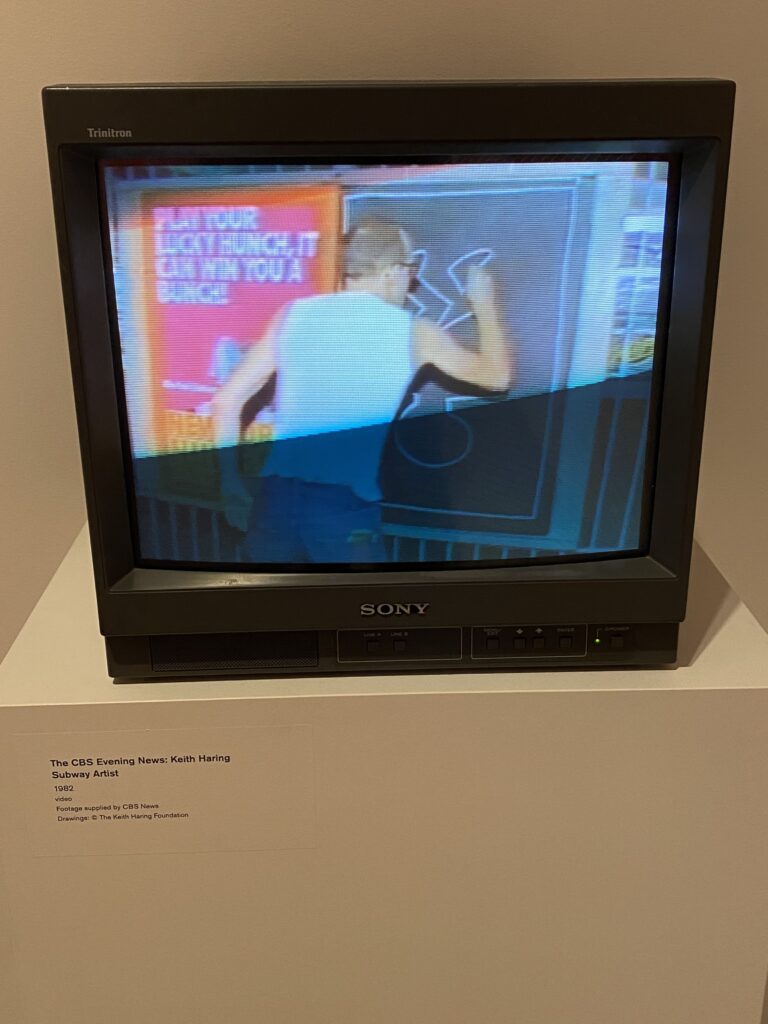
The concept of scarcity was never applied to his output. In addition to the unsigned drawings he would make in the New York City Subway system, he drew images on walls that would be visible to everyone, albeit temporarily, or on the walls of galleries where he officially showed his art. As a result, he also couldn’t be choosy about medium: acrylic on canvas, chalk, spray paint, etching, woodcuts, felt tip pen, vinyl paint on tarpaulin—he used it all. Far more important was the use of his large symbols, or “modern hieroglyphics” as they came to be known, and the way they contorted, stretched, and changed shape.
He left us to decipher what these symbols meant, but as the curatorial team of the AGO have shown in this exhibit, Haring had clear messages to share. He protested apartheid and warned against the use of crack cocaine. He was critical of the art industry’s exclusivity and its dismissal of the average person. He was critical of capitalism and the abuse of power; although, as seen in the myriad bags, watches, t-shirts, and such that were sold at his Pop Shop, he valued the public participating in his art by buying and wearing it.
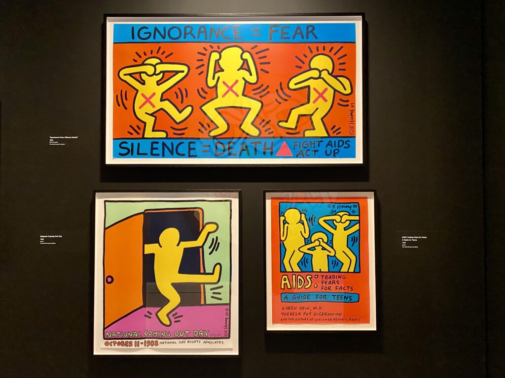
His art is also a very clear celebration of his identity as a gay man. Throughout the exhibit, we see the story of Haring discovering his sexuality, the lives and struggles of LGBTQ communities, and finally, his focus on spreading awareness of HIV/AIDS.
Haring was confident in his art, determined to make it for everyone, and with just under a dozen spaces filled to the brim with his art, that mission has continued.
Haring’s bright and loud approach was certainly quite American. But looking through the history of graphic art made by Estonians yields artists who offer their own colourful symbolism for the public. One of these, included in Kumu Art Museum's recent exhibit Through the Black Gorge of Your Eyes, is Marje Taska.
Taska drops the scratchy line work and minimalist colour scheme of many other Estonian graphic artists.
Featured alongside pieces from Estonian women graphic artists between the 1960s and 1980s, Taska, a Swedish-Estonian, drops the scratchy line work and minimalist colour scheme of many other Estonian graphic artists. Her art has a geometric focus, with philosophical, natural, musical, and spiritual subject matter.
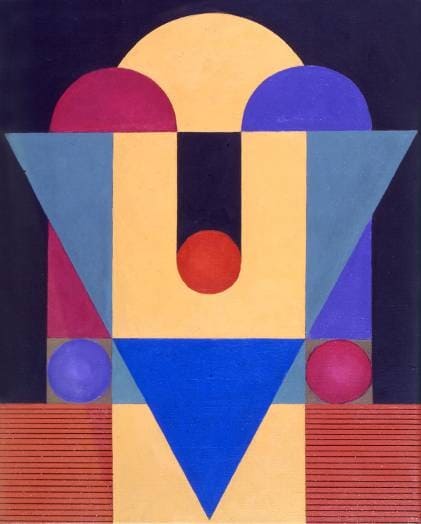
For instance, her “Sacred Geometry” series from the 1990s grabs your attention with its resolute spheres, illuminated rings, and interlocking triangles. Taska’s “Mythological Landscapes” series is consistent with the former series in that it retains geometry as a framework for each piece. The background is graph-like, with solid and dotted lines. However, the characters and symbols here are mythological beasts with scales, sharp teeth, and beaks. They are slithering forms, erupting onto a dark, mathematically perfect canvas. And these forms, these symbols, repeat again throughout the series.
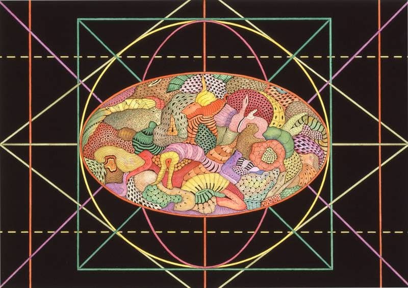
It’s through this bold, persistent, and symbol-rich approach that graphic art makes its impact on us.
***
You can keep up-to-date with Marje Taska’s latest exhibitions at marjetaska.com and see Keith Haring: Art Is for Everybody until March 17th, 2024.
